
Introduction
At TESCO there are many systems behind the scenes. A few examples include; adding new products that are sold in stores to databases, buy/sell orders with suppliers, van delivery logistics and product promotions. During the first 6 months I worked on myProduct:Induct, in which new items are added to the database, I was then promoted to a more lead position where my time extended to 2 more applications; Data Enrichment and Cost.
Where did I fit in?

What did I bring to the team?
1. Documentation
Even though there was good documentation for dev’s, there wasn’t any for product managers or designers. So if a new person joined the team it was hard for them to understand the process/behaviours of a design. I suggested having a place where this information is kept for anyone new to check out, this saved time on lengthy handovers. It is also being implemented across other applications with other teams.
2. Simplifying Workshops
UX workshops were undertaken in figma, which is great for UI and high fidelity prototypes but if you want to quickly iron out a task flow or journey it isn’t the best application. Working with other leads we came up with a ‘ways of UX’ing’ in Miro. We decided to use colour post-it notes, in the form of the traffic light system, as the main driver for ideas, changes, thoughts etc so anyone could come dive into the board and understand.

Outcomes
A whole new Enterprise Design System has continued to be developed based off research, business use cases and understanding the users needs. It is more complex consisting of 80 new design patterns & components. This includes upgraded accessibility/compatibility which is now been integrated into the consumer design system. This design system is now used by over 130 designers within TESCO.
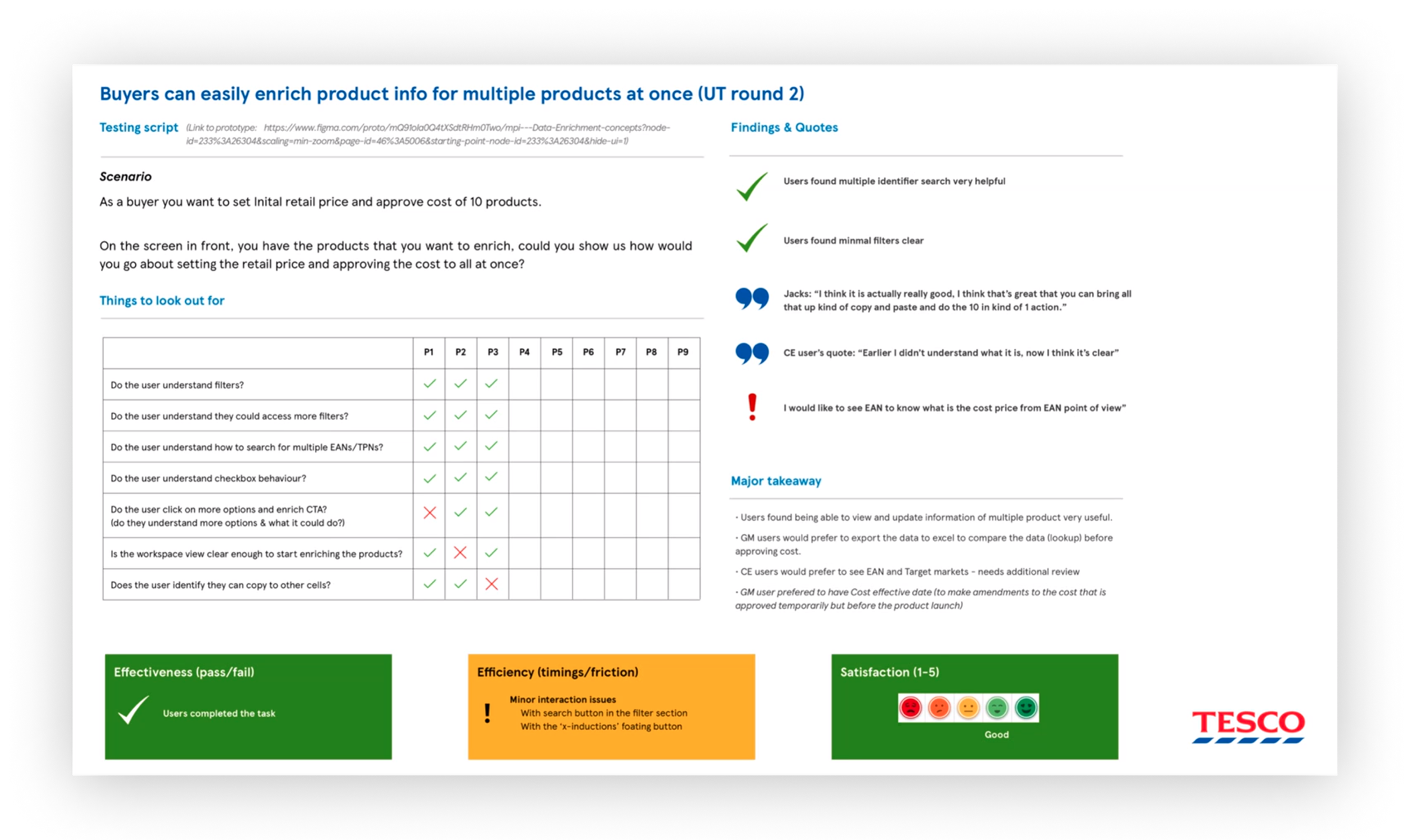
Over 80 interviews conducted in 9 months, in which those participants now agree to regular testing and get updates on new features (More happiness from them!). Amount of feedback has seen an increase of over 300%, with more regular and diverse testing sessions added to calendars.
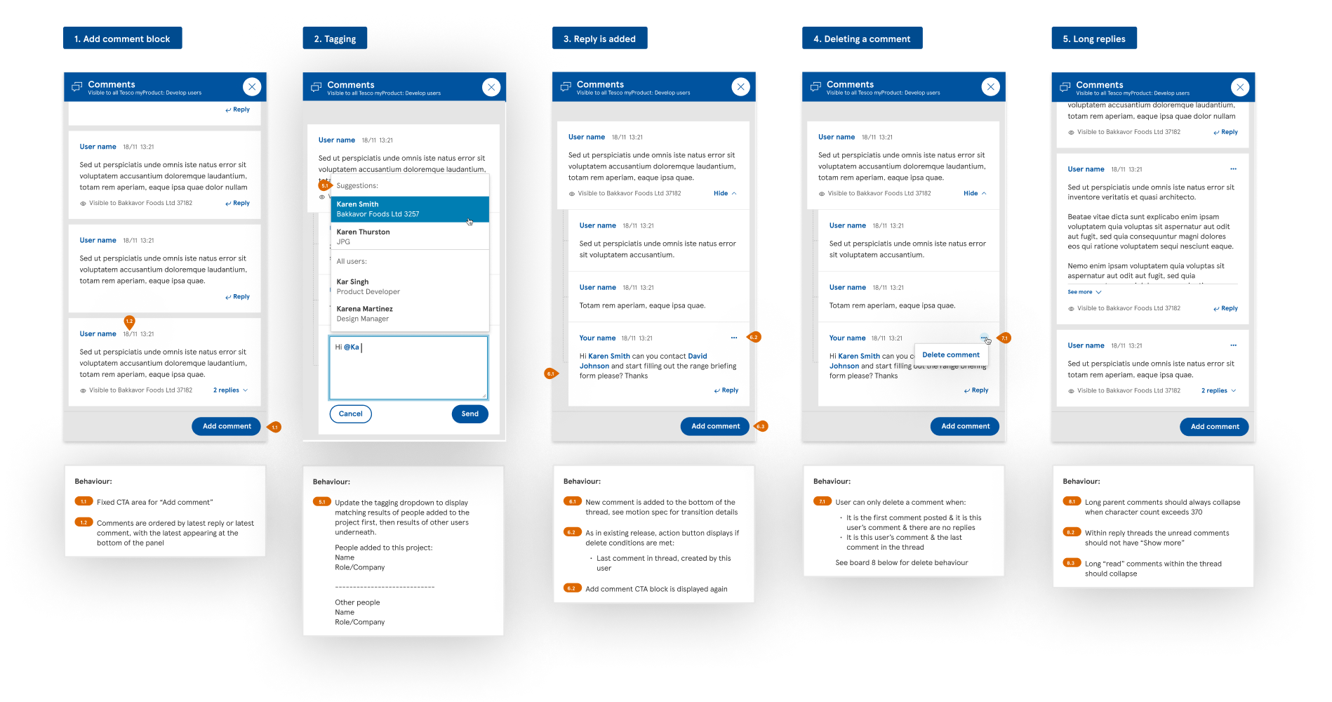
7 new feature rollouts including realtime comment system, mass data edit (100s rows of data within a table) and data visualisation interactivity.

How I approach a Design Challenge
MyProduct Induct is an application that enables suppliers to onboard their products into Tesco. The data includes price, weight, package materials and storage practices etc. It is used by suppliers and Tesco colleagues predominantly in the UK and Ireland, mostly in Food, but is scaling up to Central Europe and other categories such as GM. The induction process involves capturing product, case and pack information from Suppliers, amended and enriched by Buyers, and validated by Data Operators; resulting in store ready products, with all the required information to enable products to be sold in store and online. Once data has been ‘inducted’ it then enters the TESCO Enterprise world.
The current system is a mix of spreadsheets, internal legacy systems and post it notes on a whiteboard. TESCO’S vision is to build a suite of products that all have the same UI and can share data, making it easier to process and for users to switch from system to system with ease. The solution also improves security and allows continuous updates.
Induct Case Study
Green field project
10 months
Research, Interviews, UX/UI
Current Data Problems
Below are the problems that arise when data isn’t entered and validated correctly. One small error such as a spelling mistake or wrong type of image can cost millions if this incorrect information enters the TESCO eco system. This was presented to the team by data analysts and leadership.

The Data Flow
By conducting interviews a workshops, the team was able to understand the flow of interactions between buyer, suppliers and data stewards.
We identified a problem in the product enrichment cycle which caused a bottleneck. During the approval/reject process (where data is double checked by data stewards) we noticed 23% of data was not being checked or was being processed wrong. This was caused by sloppy manual data inputting and suppliers not being trained well enough by the support team.
We also recognised that new products were being rejected wrong by approvers. This meant that they were repeating the process and slowing things down. As well as better training being introduced we decided to look into a better way of the approve/reject process.
Below shows how a single pice of data can pass through the induct process. We used a traffic light system to identify the areas where data could get blocked/accidental editing.
Current System
As part of the research we wanted to get a deeper understanding of the current tools. We got the Data operator to walk us through there current process. We were able to identify further issues with the current system:
4-6 spreadsheets open at any time - hard to navigate, sheets, sub sheets etc
Not accessible or AA compliant
If the computer crashed the last saved version was sometimes the only accessible!
Very basic patterns/processes - limited to excel
“ Green bar indicates entry has been checked. Hidden and yellow rows are redundant information, Red rows are rejected.The first column is all the variable data we collect per individual product.”

Pain Points Workshops
Interactive session with groups of users.
We wanted to get a deeper understanding of:
- Pain points
- Gather their emotions
- Data that was entered into the system
- Potential exits for this data
- How it was used?
- Why it was used?
- Opportunities for improvement
Propose Taskflow
We mapped out proposed taskflows to gather the different journeys the user could take through the system. I.e ‘Inputting a new product’ or ‘as a data operator I want to approve a product.’ We proposed these taskflows with the data operators and started to include the engineers at this stage.
Understanding how the data was processed through the system gave us a clearer vision of who was responsible for ‘what’ data at which stage. This also helped us map potential screens/areas/patterns/components.
⚠️ We faced challenges in that we could see some user journeys becoming really long. We stepped back as a product team and assessed other similar patterns in other apps how how they resolved these issues. We setup meeting with them to see their solutions and see how they fitted in with our processes.

Pain Points Workshops
Using the various user journeys we were able to break down our design into blocks. It started out with hand drawn ideas with constant collaboration (within the design team), which quickly moved into Figma/Miro when needing to involve user for testing.
Areas that we focused on were:
1. Approve/Reject feature
2. Navigation through app (shown in drawings)
3. Save feature if user wanted to exit session
4. Bulk upload of data
⚠️ Problems arose when we designed the approve/rejection feature as a previous TESCO app had done something similar. After 3, 2 hour sessions, it was agreed this feature would behave as a pop up chatbox that doesn’t interrupt the users current session.
Wireframe > Test with users > gather feedback > iterate
During this phase we made sure any changes were driven by data and user feedback. We mixed sessions up depending on the outcome we would like to see. This involved us demo’ing & gathering feedback or them driving the prototype and watching their reaction to see their behaviour of whether they got stuck etc.
Below is an example of a typical prototype in Figma.

User Testing
When doing our tests, all our sessions used the same recording sheet. It meant that if someone was away they could got back and fully understand the findings from the session. It also allowed us to make sure there was some sort of script throughout the session and every test had an outcome or objective.
Project Outcomes
🕒 The process to induct a new product was cut from 2 months to 3 weeks (on average). This was due to files not having to be shared with the new centralised application.
✅ The approval rejection process was a massive help from reducing wrong data entered from 23% to 1%!
⭐ 24 new products could be processed a day, up from 8, thanks to the new bulk edit feature.
⭐ New product page link to 8 other TESCO wide apps.
New Product Page
New Approve/Reject feature

Reflections & Improvements
We knew we needed to improve our communication between our team and stakeholders on the effort it takes to ship the new product. The current users didn’t have any UX knowledge, so it was important to use to take thm through the UX process and what we expect from them and the deliverables form us. They were happy to work a lot closer with them by regularly attending client calls and visits, and putting processes into place to enable better push back against decisions before they were made. We hoped this would create better mutual understanding between product and data and our respective challenges and insights
Work closely with the Central Design System Team to make sure AA compliant is present at all times - avoids strain on eyes in areas of low contrast
Use visual cues as much as possible such as graphs to show data in different ways
Bring in experts who set guidelines from the gov to help us have an accessible and colour friendly Design System
As data entry can be super boring and monotonous we looked at ways ok keeping down mistakes, encouraging the user or reminding them to take breaks.
We explored gamification and the users gaining badges i.e. ‘Congratulations! you have entered 250 points of data today’ however issues arouse in that users could speed up to gain badges and make more mistakes. Older users thought the idea was patronising and felt the idea was annoying.
We also explored the idea of taking a break notifications so the user wasn’t sitting there getting bored. Even though this idea received a more positive response from users, there were contractural push backs from upper management regarding the break policy.
Better Communication
One of the problems the data stewards face is what known as data syndrome; where the user is constantly looking at rows of similar mundane data and mistakes creep in. We looked at ways of keeping this to a minimum:


