Expana is the world’s leading independent provider of global commodity price data, price forecasts & market intelligence for the food, CPG and capital goods supply chains.
As the lead in the Core squad I redefined the UX of the homepage, commodity landing page and Price pages as part of a IA exercise to drive new users to the correct pricing models and address the issues raised by users.
B2B SaaS Platform. 830,000 Users. Tiered pricing models.
Known Issues
“I’d like to favourite commodities I regularly check.”
— Carly, Data Operator
“Why are certain commodities shown to me? Are they the latest updated? I like to see relevant commodities”
— Siam, Price Analyst
“I’d like to preview a commodity so I don’t have to go back and forth”
— Sam, Goods Purchaser
“I want to check up 20 commodity prices in an hour
— Vicky, Price Analsyt
Outcome
Acquiring 44,000+ new users in the first week after launch
Opening up to a new market of customers with tiered pricing models
Resolving 9 out of 11 main issues, with more efficient searching of a commodity
Flexible, scalable and robust Design System
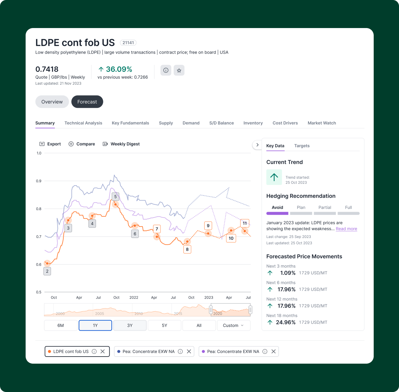
Interactive graphs that now include forecasting
Onboarding feature to personalise the experience and address troubleshooting

User analysis
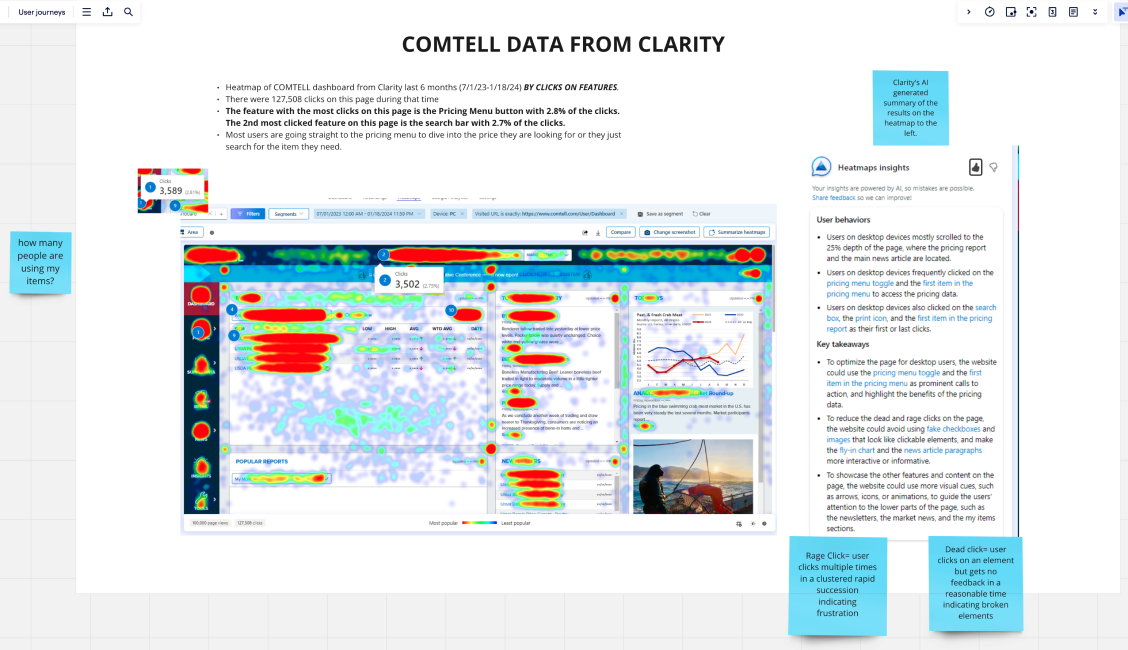
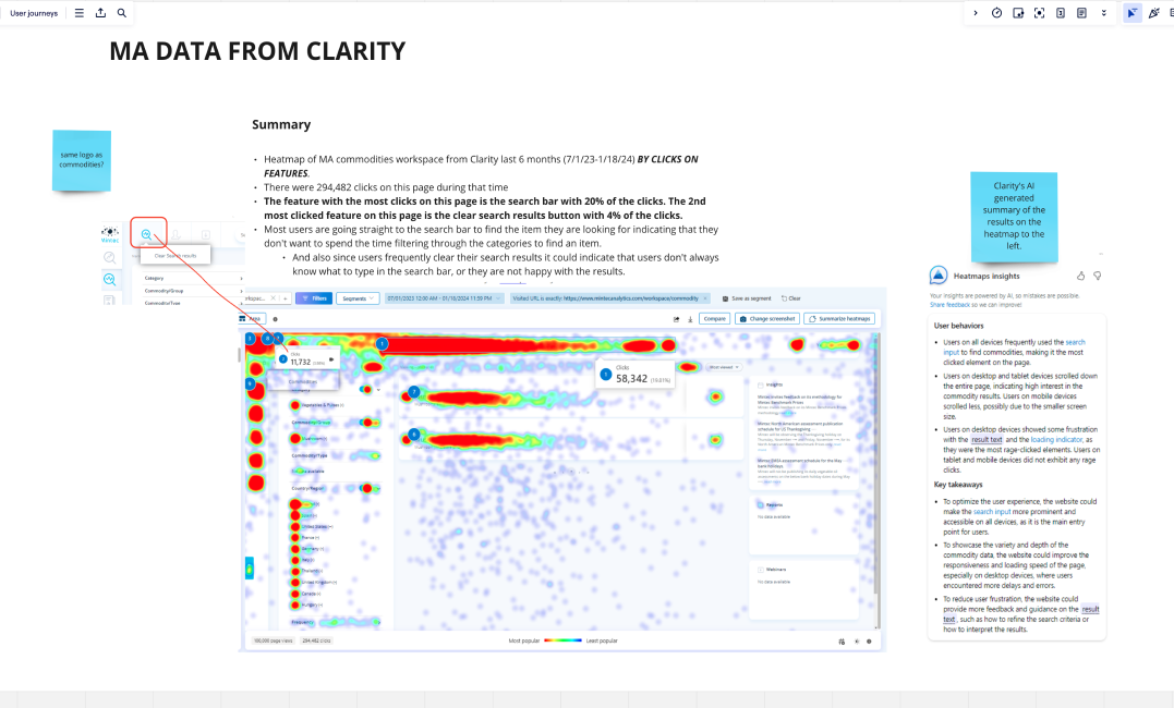
Using Clarity, a heat mapping software and hot jar to record users sessions I identified the following problems:
Users not knowing certain filters are available
Users clicking into a certain commodity to find its the wrong one and having to back
Hidden tags/codes that most users didn’t engage with
Not knowing which are the latest prices
Not knowing the benchmark price
Navigation to the forecast price
Poor use of UI
Identifying these issues allowed me to see where users got stuck in the journey, it was clear we needed to run a IA exercise and figure out how would could expose the prices quicker to the user.
Workshops
We wanted to understand what the user input in searching for the data and what we should show them to trigger commodities they didn’t know were available.
We spoke to users to understand their habits in how they search for a commodity they use on a regular basis. We found that 40% saved a commodity (52% of users didn’t know this option was available) and 33% went to the recently viewed section.
Involving star users, PM’S, devs and the design team we mocked up ideas that we all presented to each other and used a dot voting exercise on the best one that we felt best resolved the problem.
We made sure the main point was addressed: "Make my life easy and bring everything I need to me".

User Testing
When testing with users I adopted the A/B method to understand the structure and IA of the homepage.
Table design feedback:
table to complex for homepage
only shows commodities
more personalisation needed
more commodities can be shown
As testing progressed we realised the table design was best as we could show more commodities on the page at once, the same amount of data was shown for each commodity and filtering was consistent.
Once we had this established we moved more towards focussing on interactions and smaller details such as favouriting.
I wanted to make sure the user knew what they were manipulating and surfacing the right content to the user for a easy and efficient commodity search.
At this point it was fine tuning components and working with the Design System designer to iron these out.
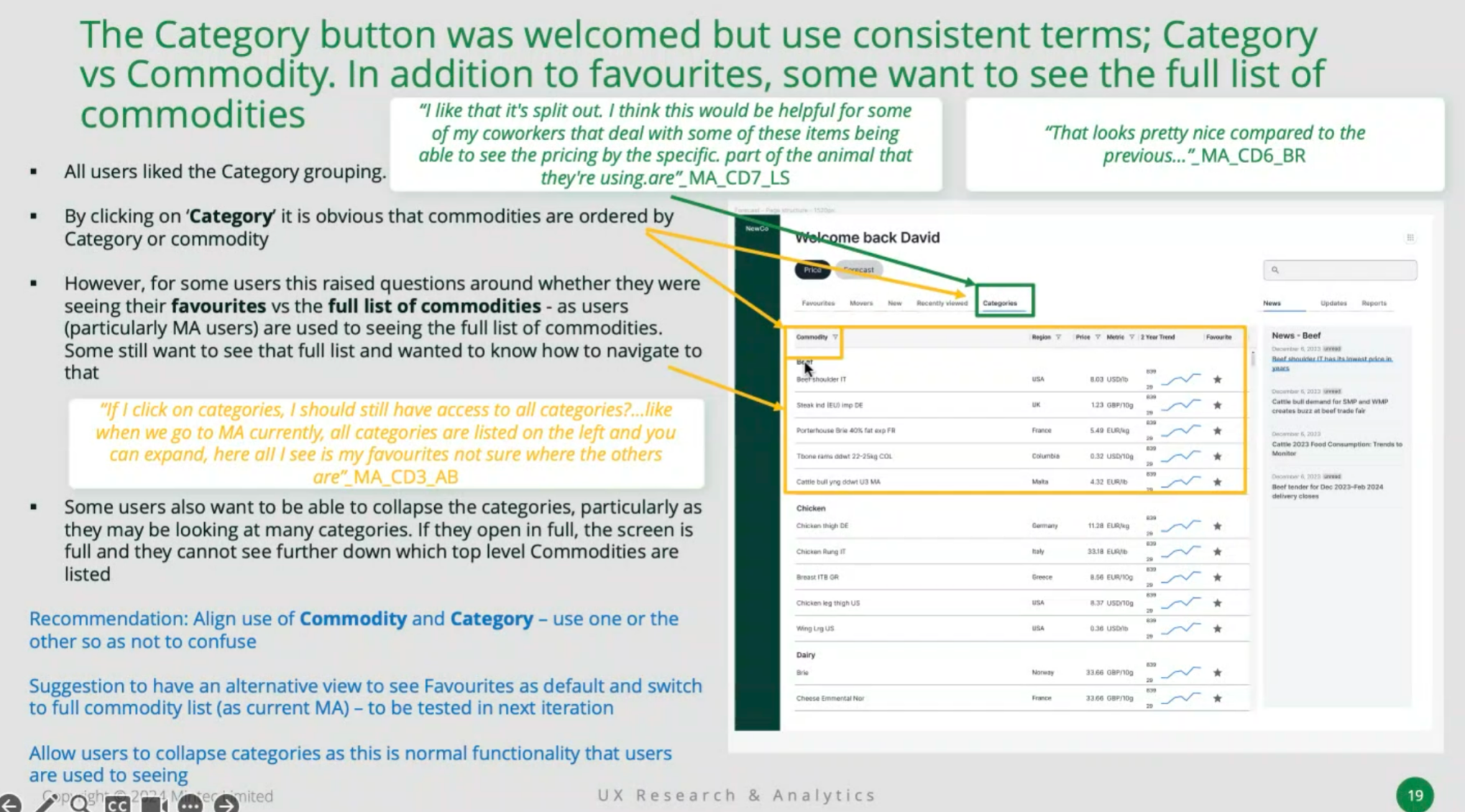
Example user testing feedback notes (above)
Card design feedback:
like card design and modular ability to personalise
more info in each card
include new and updates section
liked the top filters

Challenges faced
One of the tough challenges faced was showing lower tiered users data that wasn’t available to them.
We wanted to tease them showing them what they could have but this meant the lowest tiered user had half the data missing.
We tried to find the right balance and tested all scenarios to figure which UI was best and whether to show not available data at all.
Sales and upper management wanted the data shown but as a design team sometimes that produced poor UX.
Below I have explored different tiers and what they see.
Another challenged faced was what was the process to unlock the data? Go to sales? Pay wall? AI wizard?
I tested different theories to see which was the biggest physiological barrier to users and understand what they felt was the least intrusive. I wanted to make sure we had the biggest chance of an upsell. Below is the users registering interest journey. Even though this was the most popular option initially it did’t actually resolve the problem as a member of the team may take up to a week to reply.
Onboarding Challenge
Upon beta release we noted that 43% users skipped the onboarding. We wanted to understand why they did this as we felt this was a useful feature in help personalising their homepage. After speaking to the users that skipped this process we introduced a less intrusive wizard for onboarding so they could complete this at their leisure.
Current: We can see that the onboarding is full screen and doesn’t have a skip option. This caused users to get frustrated.
Solution: We integrated the onboarding as a help wizard that can be done when suits the user. We also took this opportunity to add support here.
Graph UI
One of the fun parts of improving the custmer experience was the complex grpahs we introduced to allow users maximum manipulation of data. This included graph overlays, different types of graphs, data points, comparisons and scalability.
We had constant meetings with devs to allow the graphs to be built within the framework and understand the possibilities available.


