
Project NEXUS
NEXUS is a future vision of what the world of booking a flight will be in 3-5 years.
It is separate to the day to day team of the live .com site.
It looks to adopt the latest technology and find quicker more efficient ways of booking a flight.
Brief
Cut down time it takes for customer to complete a purchase from an average of 13mins 28 seconds (2 adults, 1 child & infant)
Higher conversion from those searching flights to completing a purchase
Improve upgrading of seats and bags experience
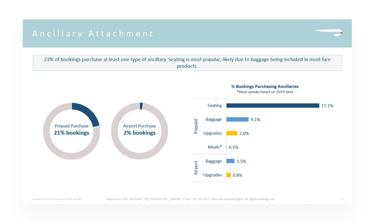
Improve ancillary booking from 23% online to 35-40%
Increase usability rating (7.2/10) by frequent flyers
Apply new UI patterns in accordance to updated DS
Meet new accessibility standards set by NOMENSA
9 months | Research, Interviews, Prototyping | Website & App
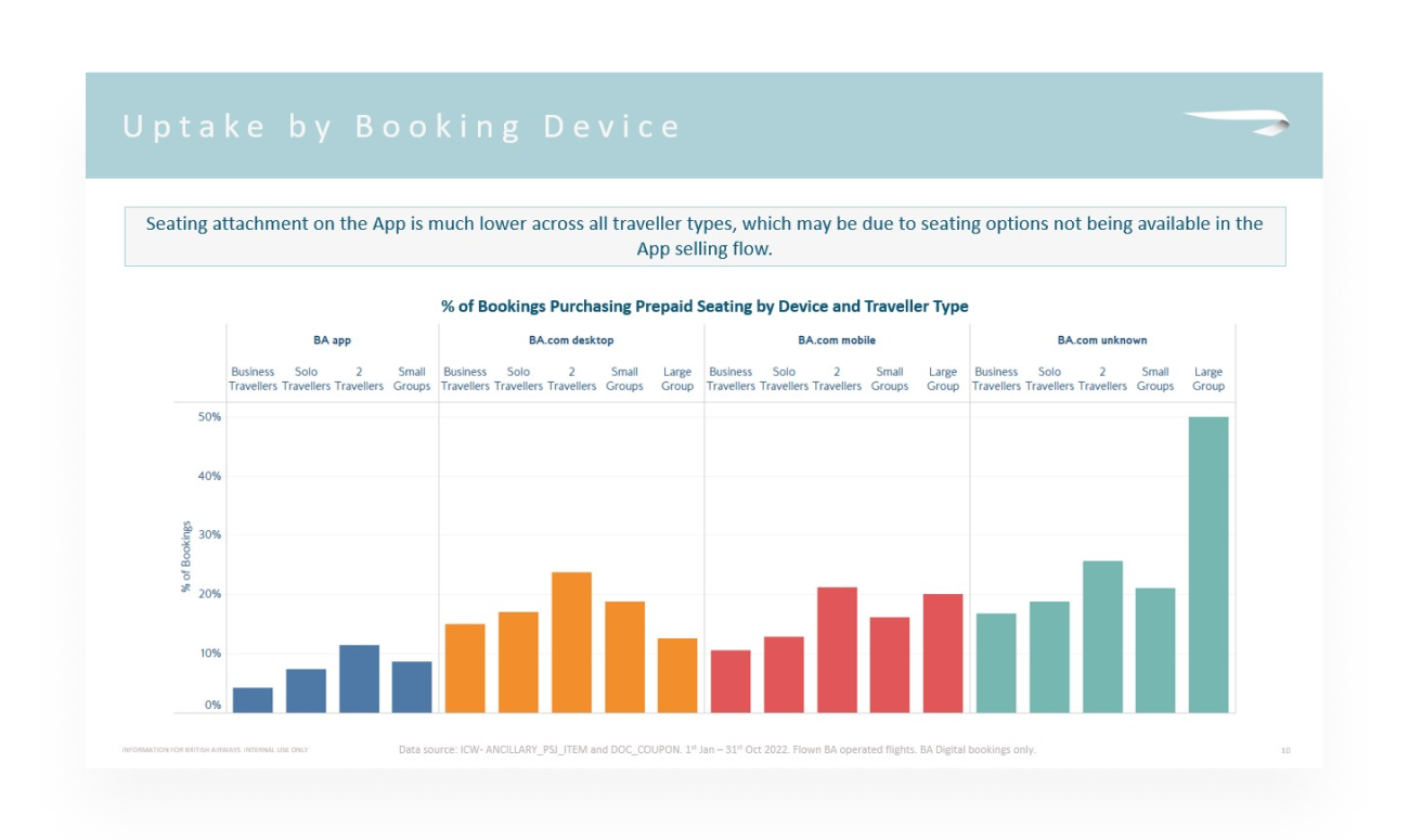
As a product team we were able to gather data from the website and see metrics such as drop off rates, where users exited the purchase journey and cabin upsell.
Conversion rates
We were also presented with further quantitative data such as device % split, % split across cabins, the amount of passengers who upgraded and ancillary data. We used this data to spot patterns and seek out opportunities for areas of improvement.


Over the course of a few days, we collected screens (both mobile and desktop) of competitors and analysed what we did like and we did not like. As a team we voted on features we liked.
We looked at:
General flow of the journey and how the user could go or skip to the next section
When the user added bags
When the user added passenger details
When the user could select seats
Upgrade opportunities for both cabin and bags
Clarity on what to pay and when
Assessing the competitors
We spoke to both regular BA customers and those who rarely fly (less than once a year) about their experiences with booking a flight.
We asked questions about what they think about before booking, who they book with, what they look for as well as past booking involvement with BA when booking a flight.
Below you can see a snapshot of the comments regarding the current seat selection page which have been grouped in themes. Each different post-it note is a different person.
The current booking process
Below you can see a snapshot of the comments regarding the current ancillaries page.

Along with the product manger I was tasked to map out the new proposed service blueprint based off our findings in research. I had to bare in mind the capability of the systems available such as the seat booking map and upgrade allocations.
To map this out I spoke to:
Legal
Data operators (booking & ancillaries)
Accessibility team
Database engineers
Security system engineers
Stakeholders
Service blueprint
Based off user feedback, one of the primary focusses was to improve the baggage section. We wanted to improve adding special baggage in terms od making it more accessible and reassuring the user the equipment will be arrived safely.
We ran multiple workshops speaking to array of users who were able bodied but had large equipment such as a push bike, but also disabled passengers with no arms who had a mobility scooter they needed to take on board.
These workshops included:
Painpoints
Thoughts when booking these items
Backend systems to cope with the requests
Booking options available
Competitor examples
At the end of the workshop we were able to map out the baggage journey and have a deeper understanding of this process.
We needed to include dropdowns of selecting special equipment such as winter skis, push bike, push chair etc during the baggage selection phase.
Special Baggage
Below is the improved user journey if a user would like to add a bike.

It wasn’t all flying high. From a UI perspective I did face some challenges.
Turbulence Encountered
Solving mobile
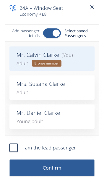
We also had issues adding passengers to a selected seat - it was super fiddly and we needed to keep the seat selected whilst having a function that ‘popped up’ to select a seat. It was imperative to find an easy way to select saved passengers but also add a new passenger. We explored and tested various designs to see which was the quickest and most intuitive way on both mobile and desktop.
Preselect
Fare cards
During the cabin selection process we had to display all the information regarding what was included in each fare. I had to make sure the information was:
- easily compare each fare
- scannable
- icons or text?
- interactivity - how would a user select
The example on the left was a pop out grid, it was well received but users found it hard to understand which item they were comparing information for.
The example below shows more of a table design which solved the issue but found it was hard to implement on mobile devices, we then explored a card alternative for mobile which incorporated a overflow scroll as that interaction felt natural for the user.
With the left hand column being fixed the user was able to scroll the cards along and easily see what item was included per fare. It also allowed us to add a business class card at the end and push an upsell.
Adding passenger
Tabs
Dropdowns
Toggle
One of the challenges we had to solve was applying seat to passengers, that would both work on mobile but also Desktop. There are a few ways of doing this such as:
Select all the seats then add the passengers
Select passenger then select their seat, select next passenger then select their seat. Repeat.
For large groups you can select a few seats and then add passengers. Repeat
Below is a video of an early concept where an unassigned passenger gets selected a seat then moves onto the next passenger.
Change of scope meant that logged in passengers could apply a seat them and not have to add passengers details at a later stage. In those situations the user has the option to do this to save time. To select a seat they can click it but on hover (hold down on mobile) this will open up a box that allows them to apply a named passenger.
In the example below you can see a logged in user explore the business class options, decide its not for them and apply a seat in economy. They also throw a validation error as they try to conitue with out entering information. They then add details for a passenger who hasn’t previously been added.
Solving complex issues

The project grew from 50 people in Feb to 340 in Sept.
However it suffered budget cuts and a sooner than expected merge with the .com team. I was unfortunately one of the 35% of the NEXUS workforce that was rolled off in October.
There are positives to takeaway:
95% users from testing rated a 7 (out of 10) or above for the new prototypes
Booking a flight for 2 adults, 1 child & 1 infant was cut down from an average of 13mins 28 seconds to 10mins 44 secs in testing
A much fresher looking and robust Design System with all components designed with accessibility in mind
Nomensa’s seal of approval with prototypes
Huge amounts of research and data points for NEXUS to share with the live .com team


