
Sign Me Up!
CommuterClub is a UK-based financial services company that retails and provides loans for annual season tickets, allowing commuters to pay for them in monthly instalments.
The brief was simple - To increase conversion through the sign up process on their website for mobile users.
I was the sole designer on the project and reported into the CEO. There was one other designer who developed the brand that was implemented both on offline and online touchpoints.
Research Project
1 month
Analysis, Prototyping, UX/UI
Mobile
The Numbers
21% customers who land on the page enter the sign up journey.
2.2% complete it.
The goal is to have 50% that enter and 10% complete.
Analysis of current sign up
Too many options links available to click out at start of process
Not sure what to click > gets confused so exits.
Elements fighting over hierarchy.
Visually seems very 90’s “DFS sale” - too shouty
There is no clear action to follow; input boxes ‘jump’
Elements jump on screen to screen through the journey
Vital information below the fold

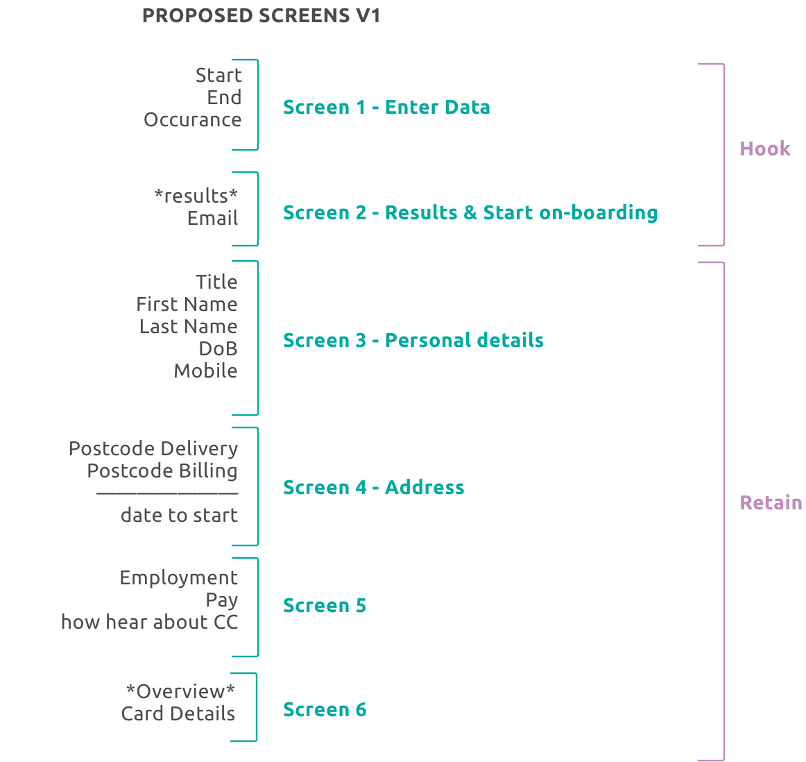
Below is an exercise I did to understand the amount of inputs per page. Without data available this could help me understand which pages had the biggest drop offs.
On the left is the current inputs per screen, on the right were my proposed inputs.
Making Changes
More balanced amount of inputs per screen.
Each screen has an input to make the user feel like they are in control, making it more likely they are to progress.
The Hook Screen
We knew the biggest drop off was the first page.
I therefore I wanted a way to make it exciting and rewarding to enter the station information and increase the % of people engaging with the first screen.
Option 1
+ Utilises positioning of thumbs
+ Fun and rewarding
+ Quick
+ Balanced
- Only for zone stations
Option 2
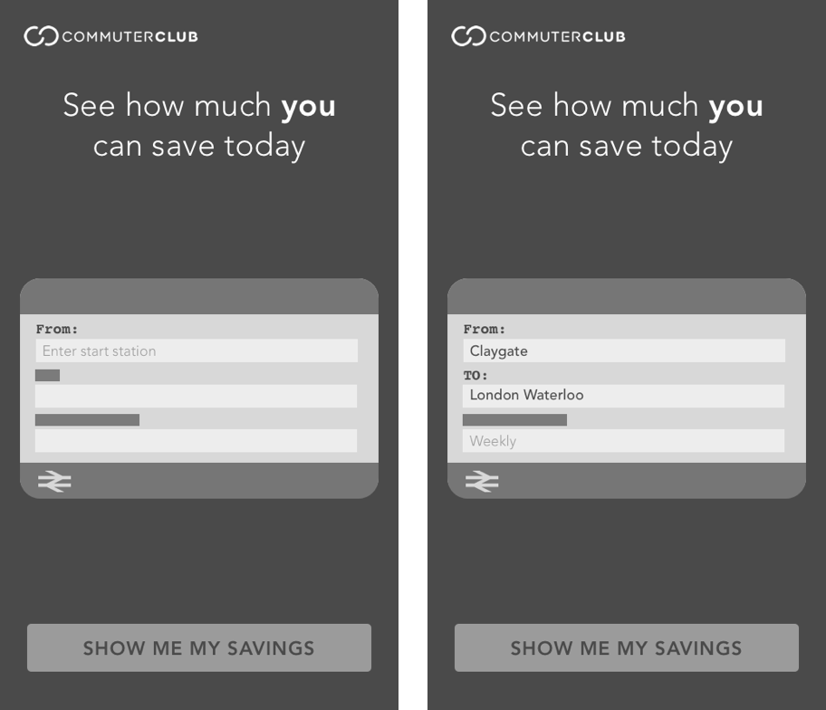
+ Visualy pleasing and ties in with theme
+ Only fill out one input at a time
+ Gameification by completing as being filled out
- Glorified input boxes
- Small and fiddly
Option 3
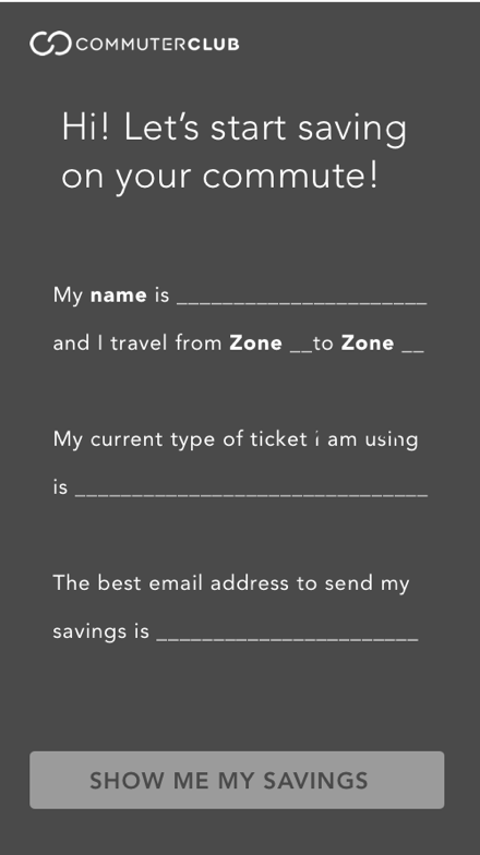
+ Feels personal and inviting
+ Different to what most inputs users are used to
+ Can get email address on hook screen
- Very long - some words can get lost
Option 4
+ Different type of inputs
+ Visually pleasing
- Cluttered
- Sliders can be clunky on mobile

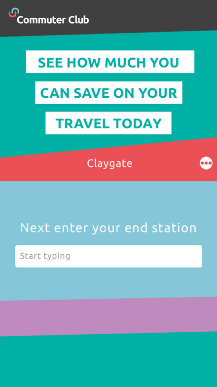
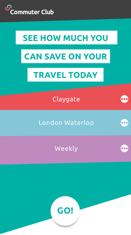
After testing various designs on mobile we settled with the below. Only one input box is presented at a time, making it clear to the user what needs to be entered.


