
Updating the app
Truphone is a global mobile network that operates its service internationally.
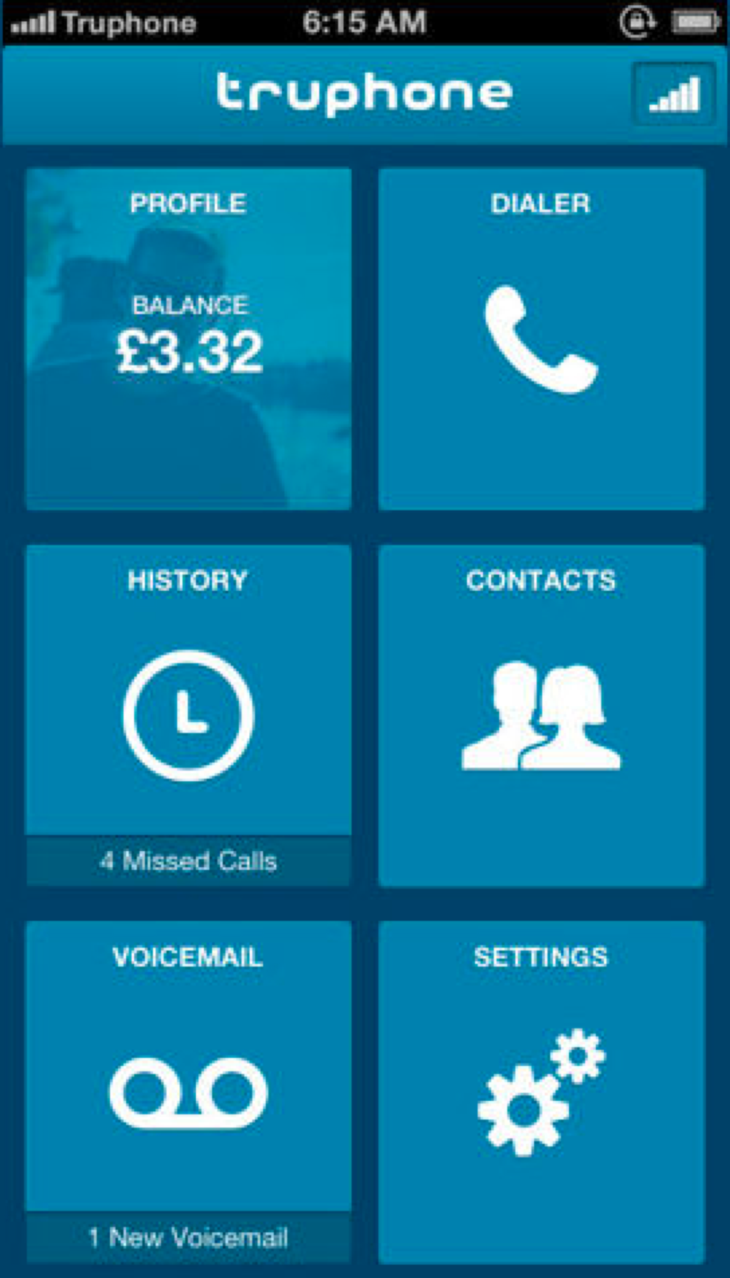
The original app was launched in 2011 but didn’t involve user testing or a real UX process. The app didn’t offer much; it just showed the users balance, history and contacts.
Poor customer feedback meant the app was pulled from stores in 2015.
The app was rejuvenated in 2019 with focus on a new home screen and ability to top up data.
New Features
4 months
User Interviews, UX/UI
IoS/Android app
Previous Comments
“I want to buy data for multiple counties quickly but can’t”
“App feels ‘buggy’ and hard to navigate”
“Where can I find a simple breakdown of my spending?”
“I haven’t had any alerts of over spending - just a message once I have gone over”

Andy, 38, Global Marketing Officer
Understanding the User
- Great technical skills
- Always on the move
- Wants to complete a task quickly
“I travel the world frequently in which I cover several countries per week and regularly check my data to see that I am not running in the red”
As a team - myself; Product Designer, 2 BA’s, Product Manager and Mobile Developer, agreed on features based on feedback and speaking to current users.
The Approach
Personalised homepage with add data feature
Quick access to ‘top-ups’
Clear auto renew showing active plans and no hidden costs
Updated UI and design system
My time would be spent 70% on the UX and 30% working with the brand team and designers in other squads to build out the new design system. I had daily check-ins with the BA’s and product manager who would work with the business to understand their needs and the needs of the user.

My initial idea was to have a world map on the homescreen so if the user was planning ahead they could select the countries they wanted in advance.
The idea was received well, however when mocked up in a prototype we found the map quite fiddly to select small countries.
Initial Idea
We went back to the drawing board and decided to include the users more. They said the key thing was to understand the amount of data/minutes they had left, then any other actions as secondary.
Below is the iterations of the homepage. At this stage it was minor UI details to really get that pixel perfect look and make sure elements were sitting at the right hierarchy on the page.
Keeping It Simple
We felt this design lacked personality and some of the text was unreadable
Depending on what city the user was in, we could pull through a pre-selected image of that city for personalisation
The app was darkened as the design system matured. We moved the add data button and made the active plans more apparent

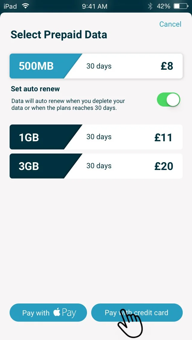
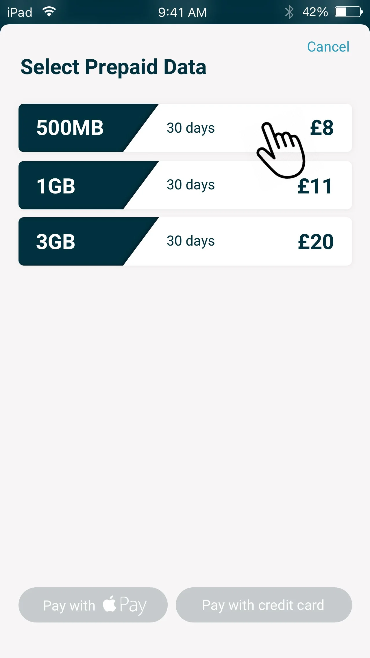
The biggest improvement was the ability to top up data. It was important the user could do that quickly and efficiently. The top up was already pre-selected to the country they were already in. If they wanted to select a different country(s) they could simply pull up the tab at the bottom of the home screen and select the check boxes.
Below shows the process of topping up data.
Topping up Data
Developing the App
One of the biggest challenges we faced was mapping out all the scenarios. New Users, Returning users, Admin, Managers that can manage their teams privileges, SIM users are to name a few.
We needed to get these nailed to suit the business needs. The SIM department needed to understand where they were feeding the data too, developers need to know each of the user rights, security needed to know where secure logins must be needed to keep up with GSMA accreditation protocols.
We sat down with the above mentioned to map out individual user flows so the business could gather the tools needed to build this app.
On the left shows a Add data flow for a returning ‘normal’ user


