Booking a Service
To comply with legislation in Australia, a service has to be offered to customers that allow them to see the servicing options of a particular vehicle - whether they own it or not. This feature needed to be added to their current app.
The Requirements:
New feature
3 months
Research, UX, Prototyping
IoS/Android mobile
Mobile (320px) - Tablet (1080px)
Find desired Vehicle using VIN or a search functionality
Results page showing the service in time or distance
See full servicing options of each car
Ability to go back and change vehicle

There was no users to this project - any feedback was internal from design shares within the product team and the NISSAN contact.
Kickoff
As a new member to the team I wanted to familiarise myself with the other features completed by the team as well as get an understanding of the design system used. I spoke to other UX designers and found out there was 2 large design systems. One for rapid UX and one for UI.
The Process
The process was a UX would work in conjunction with a UI. UX would pick up a ticket/feature and within that ticket was requirements and the problem statement for that new feature. Within the ticket was also contact details to the person at NISSAN who submitted the ticket.
Once the UX and wireframes was signed off it was passed onto UI to apply the NISSAN branding and make it pixel perfect.
“There are no users”
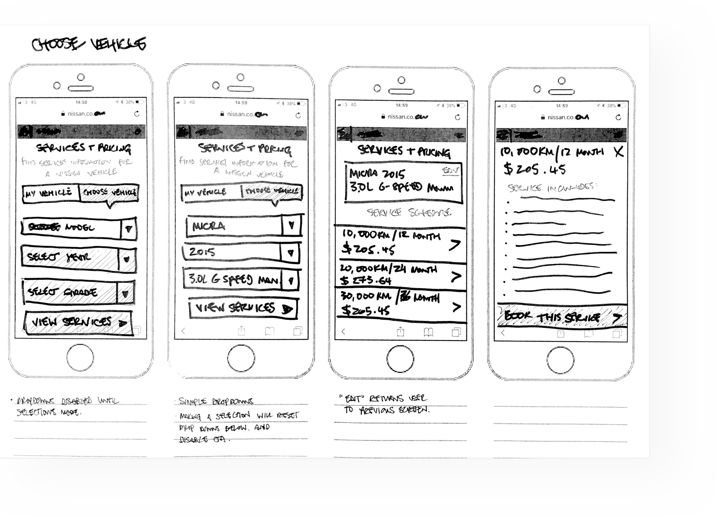
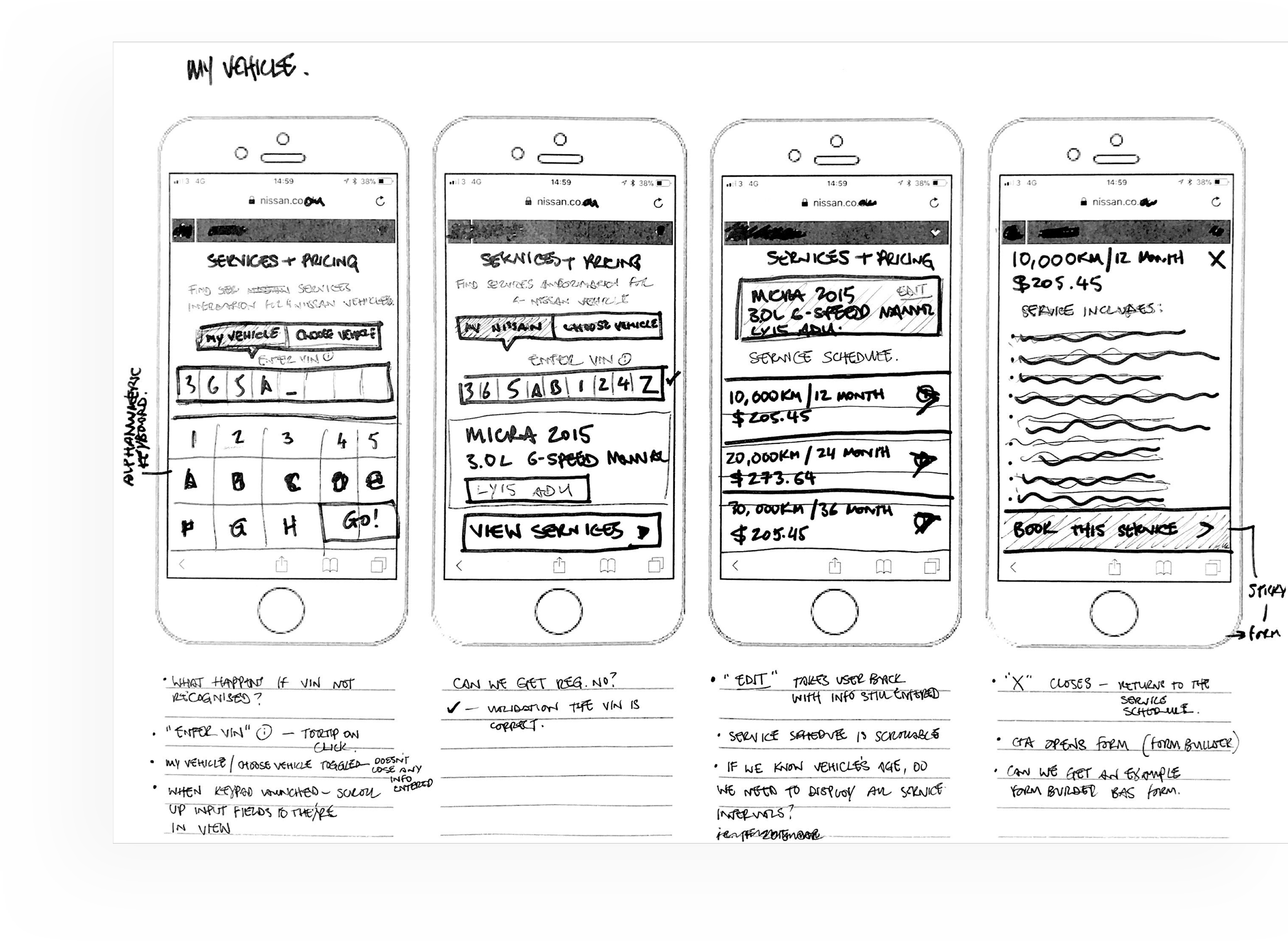
Initial Sketches
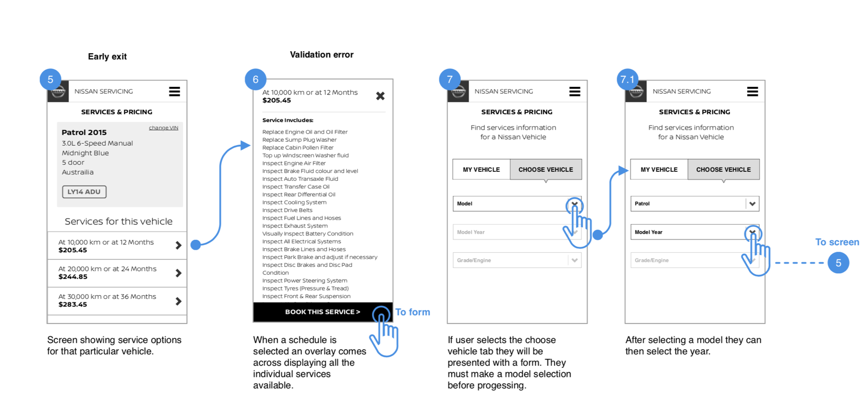
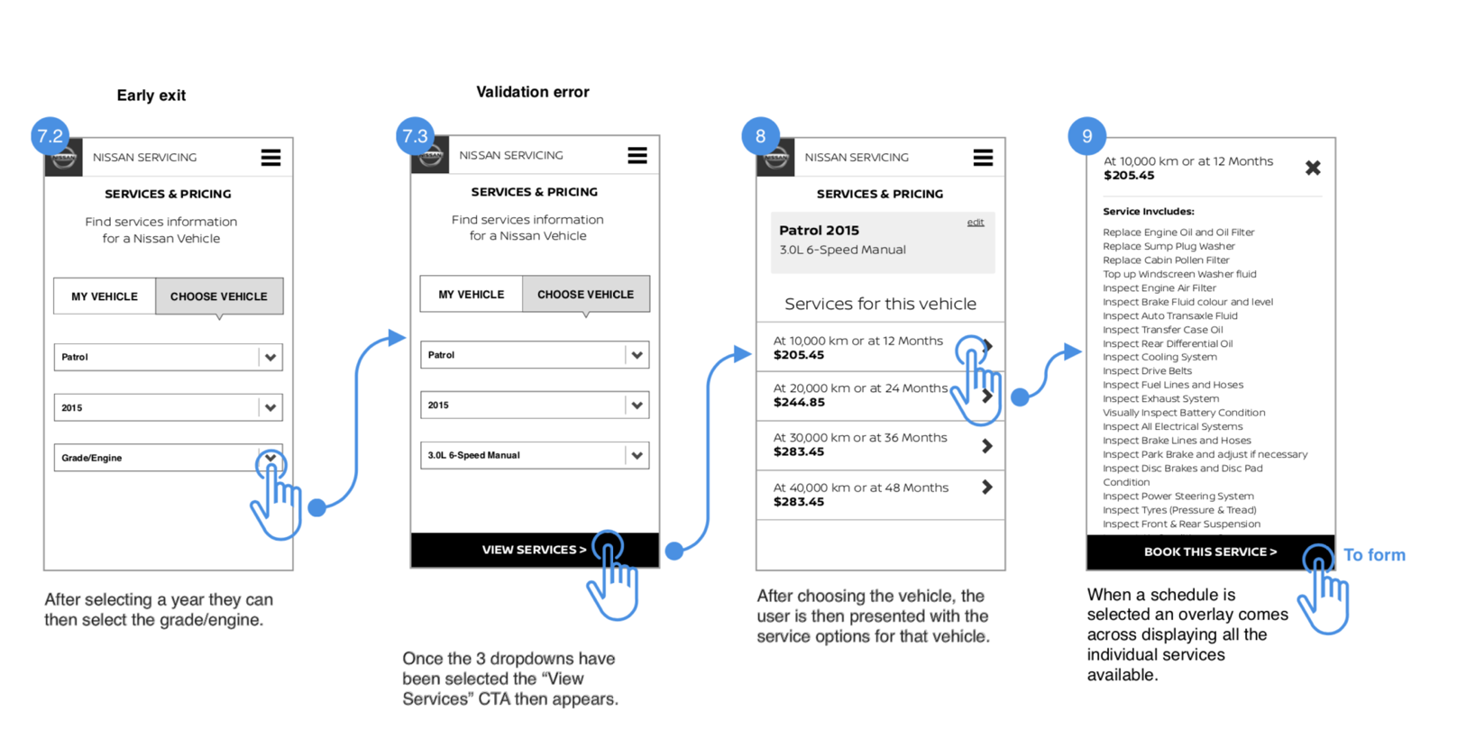
Within the ticket, was all the data that needed to be inputted by the user. I was able to use this information to create the form for the user to submit and land on a results screen. Once NISSAN was happy with the initial sketches it was into Figma to start wireframing.

One of the main pain-points to explore was how the user selects a car on mobile: whether they see a grid or are shown a simple input form. After paying around within the team and trying out on different device sizes we found that a grid was simply too fiddly for mobile so stuck with a dynamic form.
Exploration
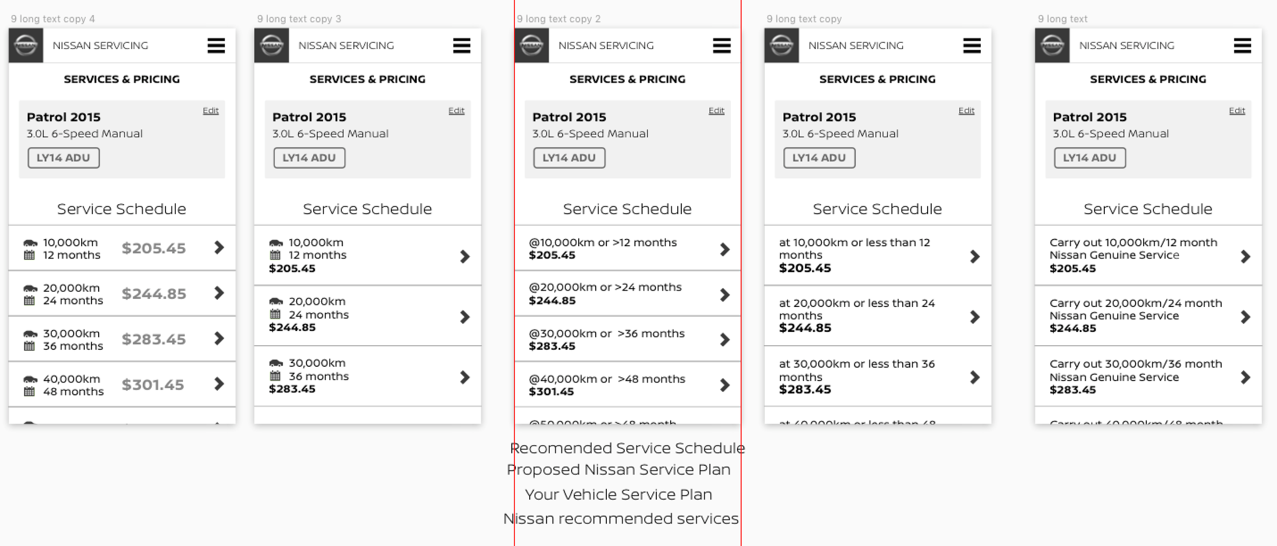
Another point of discussion was the results page. There were discussions on how we worded the distance/time; whether we included icons a as a visual cue and length of title (simple vs explanatory). In the end we went for a simple 2 line option where the text wrapped so many options could be displayed above the fold as possible.
Documentation
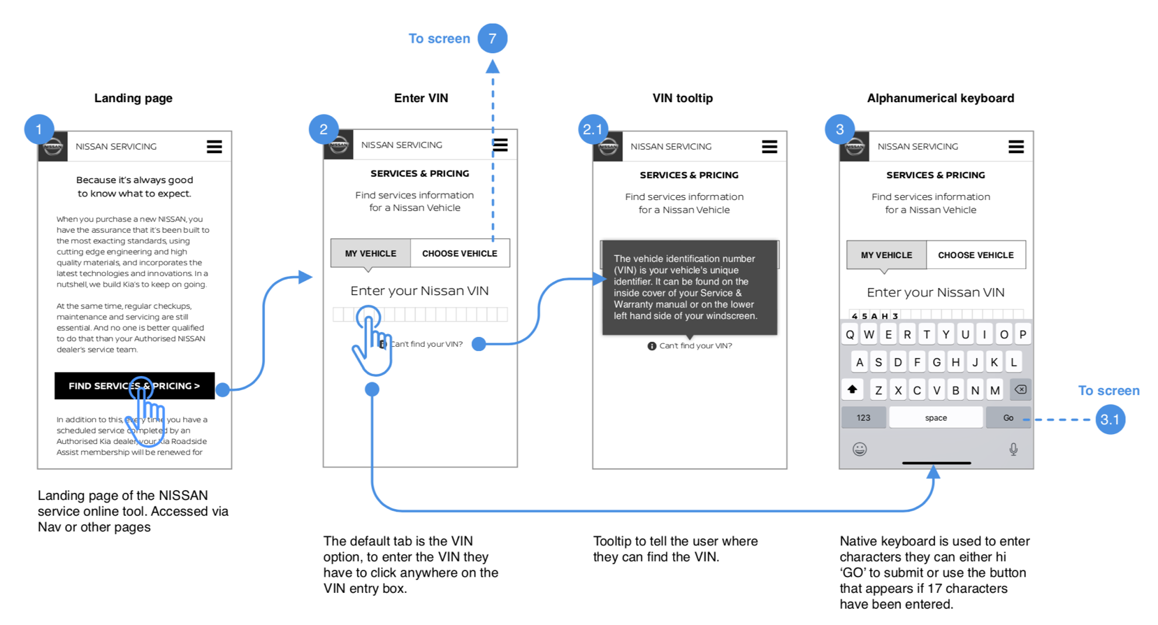
For the developers to build out this new feature (yes, they weren’t involved either) we had to document the user journey and any element they interacted with.

The project was completed on time with no major setbacks. Even though it was fairly straight forward, there are a few key takeaways from this project:
The fact there were no users meant that I was second guessing my designs and trying to put myself in the users shoes. This sometime wasted time and in the end some of the correct decisions on this project was just going with my gut instinct and relying on past experience.
The team was also a pleasure to work with, part of this was down to the fact that even though we were a wider team, we each picked up individual tickets and owned our work. So when it came round to presenting, others were nicer with feedback and it felt more valuable.
