
During my time at Houseful I was placed within the Hometrack Squad.
Hometrack is the market leader in Automated Valuations (AVMs), delivering 50m valuations a year. It enables banks to automate more of the lending journey through a deeper understanding of property risk.
The data and analytics solutions drive data-led decision making in businesses that serve, manage and invest in the residential property industry.
B2B SaaS platform.
Kickoff

Who are the users?
I wanted to understand who use the system, their actions and day to day tasks. I mapped out frustrations to get a deeper picture of the challenges ahead. Even though the current problem is based on Operational level, I wanted a wider understanding on how the Property Risk managers role to see if there was any overlap.
How does a case pass through the Process?
I sat down with data architects and head of product to map out the process and see where humans interact with the product and where it is a computer decision. Having visibility on this will help me see where errors creep in.
Within PRH, 3/8 of the sections have some human involvement. Could this potentially be reduced?
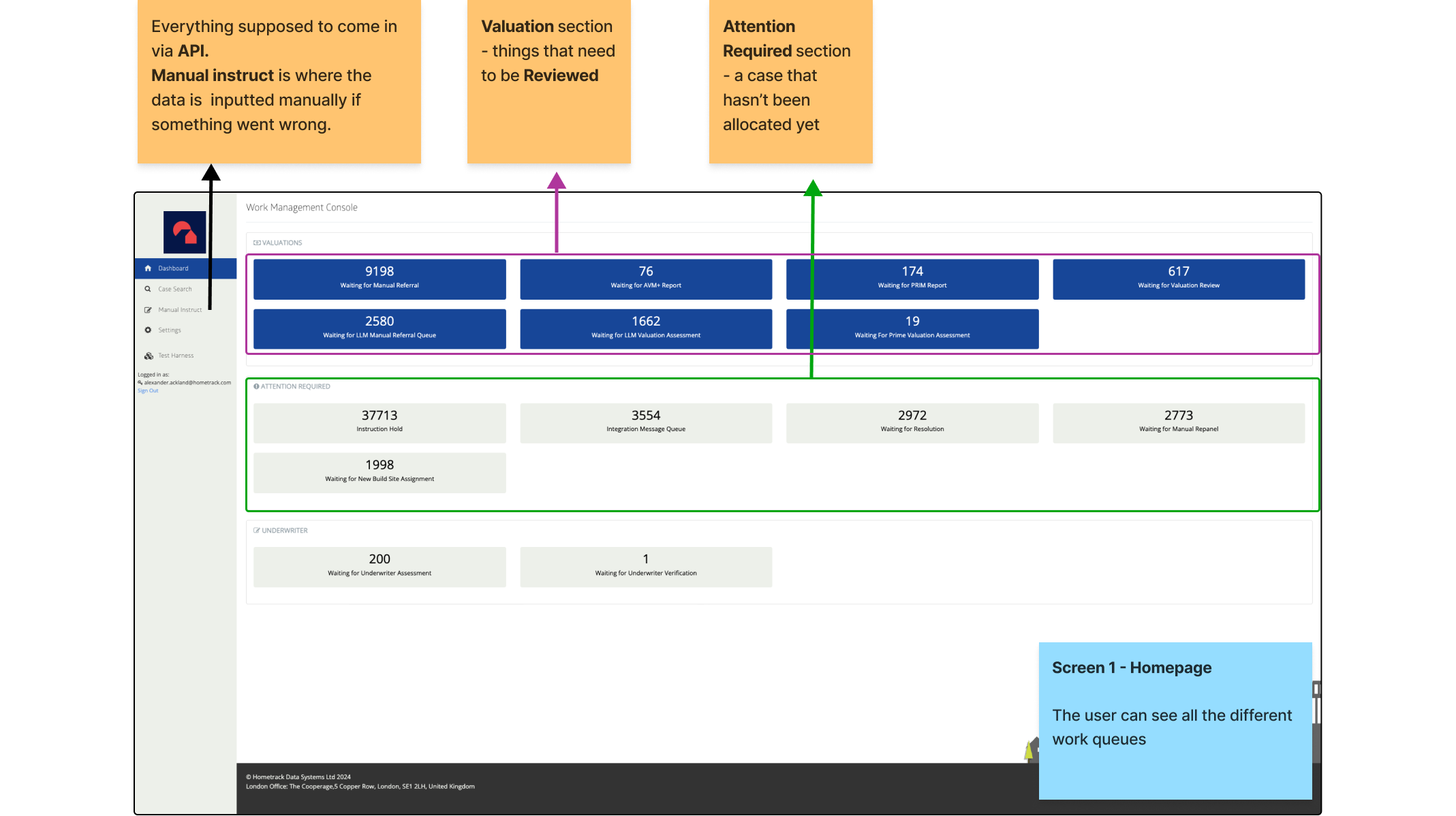
PRH UI
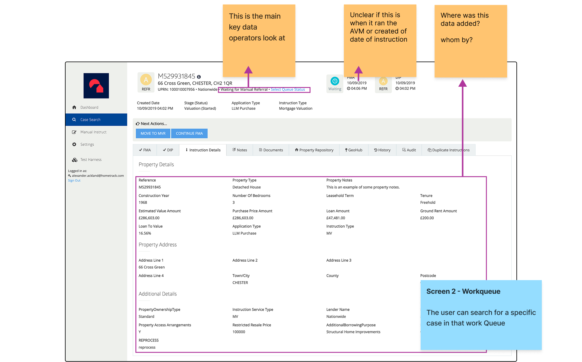
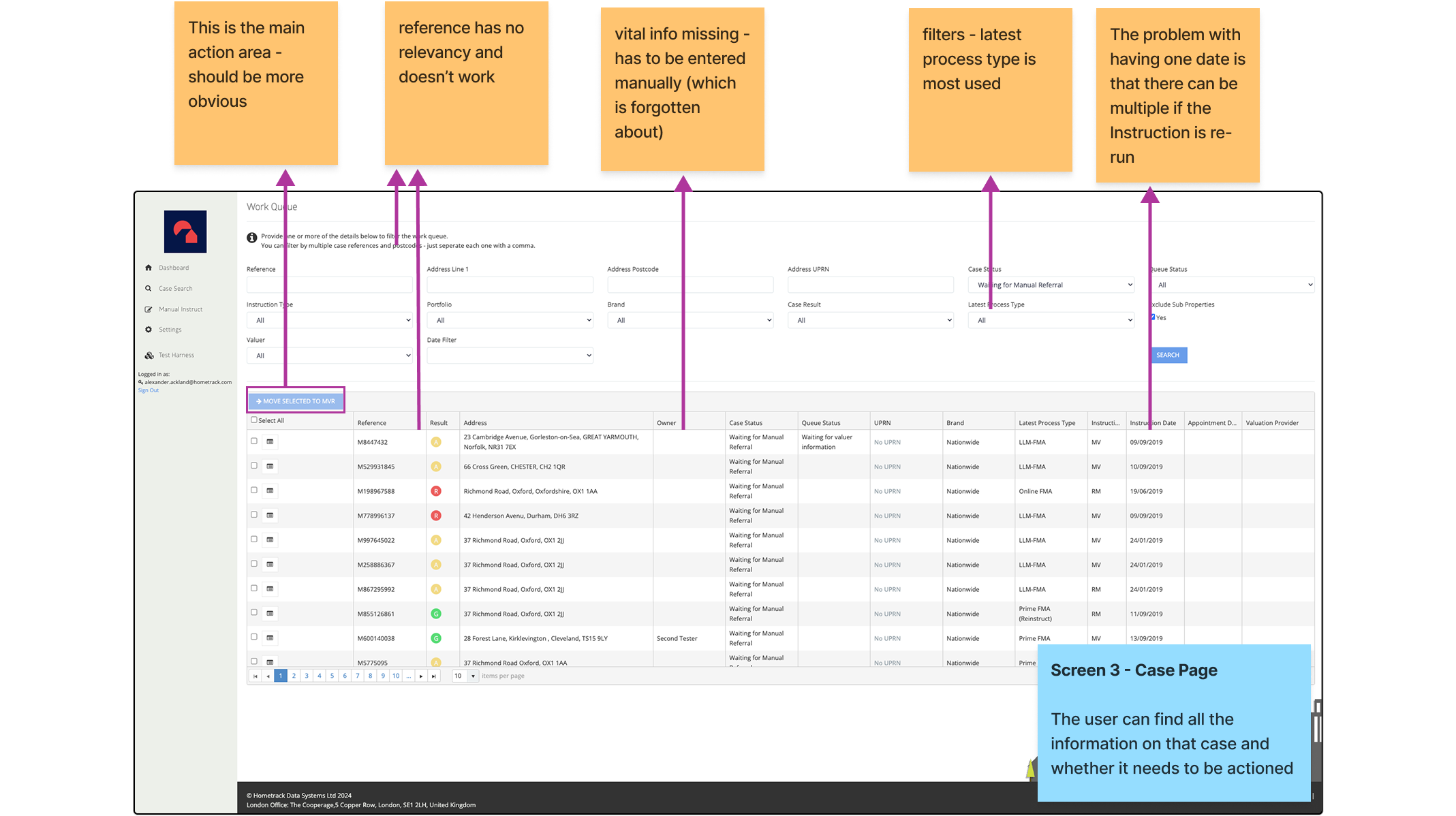
I ran session with solution Architects and Product managers and users of the system to find out the issues with the current system. I also wanted to see where the friction points were and were the users made errors.
Below you can see the notes I took in these sessions.

Understanding the problem
What I noticed immediately is the users that know what case they are looking for and those that just log in for the day just follow the same route of having to go through the work queue page.
This is because there are no notifications or prompts on the homepage.
If the users could oog and and see their actions immediately this would be a massive benefit and they can cut out the middle work queue screen and go straight to the relevant case cutting time and confusion.
I sat down with the users again and really wanted to understand:
What they expect from each screen
What they wanted to get from each screen
How it would speed up the process
How it would reduce errors


Fixing the Flow
It was clear that we needed to let the user know that a case be actioned from the homepage, and calling this action would take them to the said case page.
If the user was logging in and had no case to action they could simply go to the work queue page and use the filters at their discretion to find the next case to work on.
This:
Reduced clicks to get a case
Give a clear task order of cases to be worked on
Let the user know which cases were urgent
Let the user know if the last change was human input or AI
Turning it into screens that were iterated
Refining Case Relevancy
I really wanted to nail the fact that when a user logged in it is very clear on what they should work on and updates since last login.
I ran a task to ask what cases they would look at first and which cases had the biggest impact when unblocked/actioned. Knowing this meant that cases weren’t sitting in limbo and would be actioned sooner reducing the time it would to complete a case.
My assumptions would be that cases that are blocked would be the most important. However these cases require the manager to approve unblocking them at which point the manager has unblocked them making them less important for the case handler.
Iterating the Homepage
In this iteration I moved the Cases that need to be actioned into their own section. This increased their importance and meant that the actionable cases could then fall into the correct bucket within the case funnel giving even more relevant information tot the user.
I also got feedback to change the UI of the sorting to tabs, this would make it easier to find all the options.
We also explored having a table to show the cases from cards. The feedback was 50/50, but with the cards we could apply them into columns as a further way to sort the cases.
Below you can see some feedback from users witjtesting table vs card design.

Solving the 3 main workflows
Workflow 1: User gets a notification that a case hasn’t been actioned in a week. They log in and can immediately see its in the waiting for referral and has a clear CTA to take it to the case.
Workflow 2: User can see a case has been updated by AI on the homescreen. They can see its the latest one as its the top result. They click into it and use the compare feature to see what has been updated between 2 dates. There is also a piece of text on what has changed.
Workflow 3: User hasn’t got any cases to action but wants to view the work queue for visibility. They click into it and can see the table of contents of all the cases under manual referral. The User can change the queue type using the cards on the left.
Showing AI
We introduced an a badge to show an update between machine and user. Even though this was a simple change it:
Reassured the case handler the information is up to date and accurate
An easy way to find where the latest update came from
Saved time for a case handler double checking information

Project Outcome
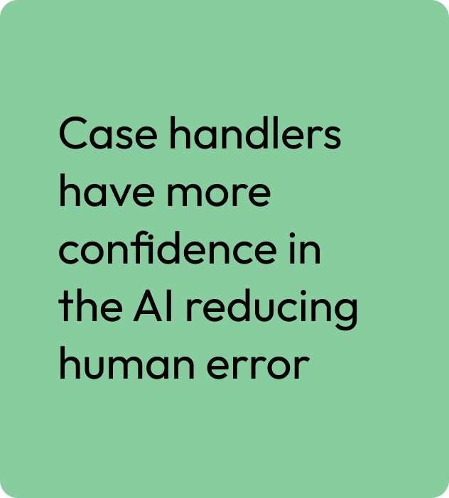
At the end of Q3 2024 users from Nationwide and Barclays were enrolled onto the new AI platform. We received mainly positive feedback with some minor tweaks needed! Here are some of the hiughlights:


